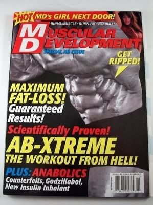
Recently not too long ago I made a trip to the Nutrition House by my local mall to buy a protein supplement. The brand I purchased was called Quick-Mass; it’s a high calorie supplement for mass building (in other words a weight gainer). While I was in the shop it occurred to me while I was looking at other brands how poorly designed a lot of the packaging and advertisements in body building magazines were. If you ever take a look at supplements, nutrients, and stimulants in body building magazines or even packaging in stores they literally look like flashy spam mail that you get in your email. Words like “T-BOMB, EXPLODE! NOS” are used, and catch phrases like “GAIN a 1000-HORSEPOWER!” I mean some of these phrases and words don’t even relate and are associated to fast cars. In my opinion it’s over exaggerated. I really think these particular brands need to reposition their design on their ads and packaging labels in a more tone-down but clever way. I mean, having an over-exaggerated and flashy advertisement may be appealing to the eye but there is already too much of this crap and it’s just adding to more visual clutter.

1 comment:
Not sure if its appropriate to post this, but your entry reminded me of a video I saw on youtube recently that mocks all the staples of energy drink / protein supplement advertisements ...
http://www.youtube.com/watch?v=dXdXSAqWdfI
Check it out, its pretty funny.
Post a Comment