
I started buying Lush hair henna for my mom a few months ago, not really interested in their products myself. After my second time visiting, however, I was looking to buy hand lotion and wondered into Lush. I was informed about their massage bars that also act as moisturizers, and was intrigued not only by the delicious smells but also by their different shapes. I decided to try some myself, and was very pleased with my purchase- it leaves your skin smooth, but not greasy and it lasts. The next time I visited their newly revamped location on Queen street I was made aware that they were having a sale on none packaged items. So I took a look around and took interest in their all-natural face scrubs (whish also smell great.) I purchased a small tub and was surprised at the gentle yet freshness it had, that my drugstore bought cleanser lacked. It was then that I received a pamphlet on their products, many of which are preservative free, use less packaging and are healthy for your skin. They’ve got you covered from cleansers, to deodorants, to shampoos and hair henna AND it’s a better solution for our environment. So I say, props to Lush.
Once you try it, you're hooked!
American Eagle ... at Payless?


Recently when I walked by the Payless ShoeSource
at my local mall, I've realize that their Logo has changed.
As you may recall, their previous logo was ugly Brown-Orange
-Yellowish colour, very cheap looking, and indeed matches
what they sell. Their new logo looks a lot more sophisticated,
yet kept it clean and simple. When I walked by, I also saw
A big poster selling American Eagle shoes... however I was not
fooled. Being a visually interpretive person as we all are, I noticed
that the logo wasn't the same as the Eagle from American Eagle
"Outfitters". I chose to write about this because just yesterday
my brother and I somehow got into this conversation, and he was
arguing that they were the same, when clearly the logo is different.
I was trying to explain to him that businesses don't change their
Logo's for no reason and have 2 at the same point, especially
in the fashion industry. But he was so confident that he shook on
a $100 bet. So we Googled it and turns out that indeed, they are
different, and American Eagle Outfitters has also filed a lawsuit
against Payless.
For more Information, visit the Boston Globe Website:
http://www.boston.com/business/articles/2007/04/20/american_eagle_sues_payless_shoesource/
frutopia at it again
amoeba corp and socimedia are really trying to breath some life back into this brand. http://www.fruitopia.com/fruitopiasecure/enter.aspx i really like the premise of this contest. it's not one of those mindless check-under-the-cap-and-win dealies. i also like that it encourages you to look at and rate other's work on the online community. this isn't a show stopper idea, but i do think it's a good solution to frutopia's branding problem right now. i mean those commercials they always show at the movies are cool, but i mean, let's step up just a bit more. hey, remember the snapple lady? last i heard, they fired her at snapple. i'm just sayin' is all.
Why the change???


"The tv station you once knew as TBS is now changed to 'PEACHTREE TV'" - said the announcer on tv.
Why this change? I have always been a firm believer that the logo for TBS was so sound and solid that this change is just absolutely unnecessary and stupid. i mean how do you go from a simple and sleek look to a design that look like it is meant for kids who watch tree house? I believe it is a big change that came un-announced and too quickly and even though i will not understand the politics that went behind this big change, i do know that the logo couldv'e been executed a lot better to par up with the previous logo. The upside-down dome shape under the tbs just works so well on its own as an icon for the station. it looks like a mouth laughing which ties into there slogan "very funny". but now, its not so funny anymore. Its ugly and unpleasant. As i am writing this, I am currently watch Matrix Reloaded on "peachtree tv" and i notice that the intro and outro reels into the movie are just so different and to me, ugly. Kinda like they completely changed the administrators of the Tv station. In this case I would advise - please go back to the past or continue with the changes you are making TBS because this is not good enough.
How to be a Top 100 Brand

When most people think of a company rebranding themselves, they think of redesigning or revamping a logo, creating new products and package design. During this past week I came across a 2004 BussinessWeek article that showed me there were many more ways to reenergizing a pre-existing brand. The article listed the Top 100 Brands at the time in the world. The top 5 brands were the same as the previous year, #1 being Coca Cola for the past 2 years, but some of them had lost their strength and power over their competition due to poor management, competitors introducing new products and bad publicity. While some brands did use the traditional forms of branding I found that some brands made small changes with their pre-existing products and did increase in popularity. Some of the brands included Marlboro who reduced their prices to compensate for higher taxes; Citibank decided to expand globally and Gap used celebrity endorsements. However the brands that did lose and gain the highest percentages of notoriety were due to the introduction of new products and design concepts.
New NFL Logo

Unlike other companies who make drastic changes to their logo, the NFL made subtle changes while keeping the classic design. The new logo illustrates a more refined, simplified version of the old, the football is shown is a way that is more iconic and 3-D without using any unnecessary gradient, the number of the stars are reduced down to 8, creating a more clean design. The colour choice of the darker blue also frames the logo better and makes the letters stand out more. They've also changed the NFL to a modern typeface, although i kind of like the aesthetic of the old one better, but i guess the new is to represent a modern apporach. Overall, i like the fact that they keep it simple and created a more refined design while honoring the the classic logo.
Razr Craze

About four years ago, Motorola introduced the Razr into a huge pool of cell phone designs. I had one of the first ones, when it only came in black or sliver. They’ve since “pimped it out” and branched from the original design. It still looks the same, but has a little more juice and a few more options. I can proudly say that among the 50 million that have been sold, I’m not a customer that has returned it. I have never heard of so many recalls on Razr’s because of poor reception, inconvenient fragility and overall bad performance. I have yet to have an issue with my phone, and I hope I’m not jinxing myself on this. I love the directions Motorola has taken in terms of technological design, however they need quite a bit of help on their advertising.
What's in a Name? - A whole lotta stuff
Master, the plans...
Igor, a naming and Branding agency based in San Francisco, released some years ago a rather lovely (and rather thorough) PDF titled, Building the Perfect Beast: The Igor Naming Guide.
"We created the Igor Naming Guide in order to demystify the naming process. In it we show how and why great product and company names work, when focus groups and standard ways of thinking about them might have predicted otherwise. Igor's own naming process is presented in excruciating but logical detail."
Sounds kind of dull, I know. Especially that bit about "excruciating but logical detail." I recognize this reading isn't the most-gripping literature, but it's a guide chock full of practiced knowledge and is well worth the 96-page download. I've referred to this guide myself during naming projects and it is helpful in that it offers a kind of template for the naming process, with helpful "do's and don'ts" along the way—almost always citing real world brands as examples.
Boring? Perhaps. Interesting? Very. And light of our current rebranding project, I thought the guide could come in handy to some of us
Download: Igor Naming Guide
^^^
WALMART- high cost of low price

I've recently watched this documentary about walmart. It seems that this all american brand has taken over not only large suburban areas but small american towns, and by doing so has made it virtually impossible for other small, family owned businesses to sustain themselves. These issues also affect canada. During my roadtrip this summer, I've came accross multiple small towns, with a population of a few thousand people. And even there, there was a wire range of one-of-a kind business locations shut down and left abandoned, while the tim hortons and canadian tire, are up and running and doing better than ever. I reccomend this documentary to everyone, you can find it on Google video.
Anna.
What’s in a Name? – Absurdity

So a few of my female cousins who are in their early ‘tweens’ were talking and sporting their new Coach bags, which ridiculously stood out from the rest of their attire. Curious, I ask one of them: “Why do you like this brand?” She replies “It’s COACH…don’t you know?” Apart of me was actually hoping to hear, “I like it” or “It’s pretty” or even “My mom bought it for me” but apparently this is all that was said: “ITS COACH…DON’T YOU KNOW??” At that moment I felt dumbfounded. I had a good feeling they don’t even like the look of the bag - Coach is a mature brand that sells leather goods such as bags, wallets and accessories that gives off a very distinct mature look feel and style targeted to middle/upperclass women. These girls, who were clearly unable to afford these items, were like flocks of sheep sporting it solely based on its status and nothing more. I don’t recall purchasing/wanting something based solely on its name or status. You would at least expect them to sport a brand because ‘it looks cool!’ Instead, they have embedded the word ‘cool’ into the name. This is a case where the blurry line between brand follower and brand idiot has been crossed. Forget the absurdity of their appearance; just hearing them respond the way they did made me feel embarrassed. For these girls, branding has worked beyond its successful and appropriate use.
Go On A Tangent!!

Fruitopia, well known beverage company, was introduced in 1994 as Coca-Cola's attempt to muscle in on the success of teas and juice drinks made by Snapple, which later was bought by the Quaker Oats Company. It was targeted at teens and young adults.
Fruitopia’s colorful labels and their advertisement always catches people’s attention.
In the web site, there is very interesting contest going on . It’s called “Go On A Tangent Contest” and I found the commercial method is pretty interesting.
Coca Cola is aiming for low-cost advertisement by having people involved and people around participants will automatically meet the brand Fruitopia.
Additionally, since the prize is very concentrated on people who are interested or involved in graphic design, it is expected to attract much attention.
The Hyrax.

Juicy Couture


In the Fall collection of 2007, Juicy Couture once again changed the tags. The tags still consist of a pink tag but now include a piece of cardboard that says "Choose Juicy" on one side and the story of the collection on the other side. There is no longer a pink ribbon.
One of my friends is a big fan of juicy, she keep saying that juicy has come out a new bag and a new skirt recently. I remember she bought a laptop case before that didn’t fit in her laptop, and she bought a pair of juicy shoes which hurt her feet and even bleeding. That makes me feel a bit annoyed and curious. Why there are so many people are fancy with it, although they don’t fit in it or feel uncomfortable. As Juicy Couture already established a well-known brand, and created a fashion trend. That created its reputation psychologically and also emotionally enforces people to purchase the product.
working out is expensive enough


I work at roots, as i mentioned in my last post.While working at this company I have noticed a new trend in customers workout clothing. While at first we only sold sweats, now there is a wide variety of clothing one can wear to work out in; basic sweats, the extremely popular yoga line, fashion sweats, leggings, etc. And while we are only one store who sells lines like theses, out major competition would be that of Lululemon, a fellow Canadian produced althetic clothing shop. However, their line is completely based around yoga. Both stores, which sell the combined greatest amount of yoga work out clothing, have competive pricing ranging from $70 - @125 dollars for pants, and outfits going up to $200.
Now this may just be me, but I love the yoga line at both stores, but i feel its a bit sad to have both companies sell their products at similar outragous pricing. Wouldn't it be better if one store dropped their pricing. Working out is expensive enough with equiptment and memberships alone, who needs to purchase an outfir for upwards to two hundred dollars.
* pictures show a few styles of the lululemons, and canadian singer avril lavigne wearing a pair*
GAP

I have noticed GAP fluctuate in terms of brand strategy and its target. In past years GAP's quality as a brand, had been deteriorating and its showed in loss of revenue and overall development. All large companies experience ups and downs, but not all come back with force, GAP is an exception. Having the ability to watch and experience the quality of GAP and its character is quite exceptional. The overall thread quality is at its highest, and the cultural statements being made by GAP,which includes their campaign, "Inspi(red)", are creating only positive feedback. They are tapping into trends and social awareness which is helping push the brand quality of GAP to new levels. Overall, I believe that GAP is a very positive brand, in terms of politics, social awareness and quality.
An Evian Fit For a King?

A couple of days ago I bought a bottle of Evian Natural Spring Water. I was admiring the design of the bottle. A friend of mine then told me that Evian had recently released a new luxury bottle that was specifically featured in fine dining establishments like hotels, restaurants, and clubs. So I decided to find out more about it.
The new bottle is called the “Palace Bottle” and it’s absolutely stunning. It not only has a sleek shape that reflects the brands heritage in the French Alps, but there is also a pourer built into the cap and a sleek coaster to catch the condensation. Evian has been known to cater to a customer that demands the highest quality and style, and with the bottle's stylish accessories, Evian becomes a unique fine dining drinking experience.
Creating new and innovative packaging is nothing new for Evian. The company has been involved in fashioning creative products and packaging for decades, including unique designs like the Nomad sports bottle, limited edition teardrop glass bottle, flip-cap bottle, 2007 French Alps bottle, hot pink label, and the 2006 limited-edition Romero Britto glass bottle. It’s quite amazing that they are able to market a simple product like water to such a vast audience because there are simply so many environments in which their consumers enjoy the brand: at a club or spa; the gym or beach; at work or home; and so on.
Rockport promotional campaign


On my way down university street last week I ran into some of these semi-nude mannequins and a bunch of guys giving out pamphlets besides them (they were fully dressed however, in gray suits with an orange stripe running down the sides of their pants). I thought that the guys looked quite put-together but it really made me wonder what they were doing besides those mannequins wearing only ties, underwear, socks, and shoes. The whole thing looked pretty funny and ridiculous, and I was amused enough to want to find out what it was all about. To my surprise, I wasn't handed one of the brochures but had to go back and ask for it, only to later find out that it is entitled "The Detailed Man's Handbook"! The booklet explains what is a detailed man and how one becomes him, accompanied with a lot of ridiculous tips on keeping shoes stink-free, clipping nose hair, complimenting women, etc... This was a promotional campaign for the new Rockport line of shoes that features "Torsion system technology " by Adidas, a shoe that combines the style of a dress shoe and comfort and technology of sports footwear. I thought that the whole branding and marketing was cleverly done and carefully positioned, right in the financial district where there are lots of young businessmen - those who have to look professional yet want to show that they have a fun side as well. I am still wondering whether or not the campaign targets only men, because that would seem like a step in a wrong direction. Other than that concern, I think the branding was quite successful because my initial reaction made sense once I've read the contents of their brochure and found out that the humorous aspect was their intention. I think that the look and feel of the whole campaign is in sync and that the consistency of the campaign is remarkable: from orange gray uniforms, to brochure design and the website. I believe that the campaign will be successful at attracting the attention it is going for. Anyone else seen it?
$25,400 Ferrari phone

Wow! Here is a cell phone that costs 25,400 dollars! It is very expensive and is equivalent to the price for one car. For the consumers who want nothing but the absolute best, Nokia, debuted Vertu a new cell phone, called “Ferrari phone.” This product commemorates the 60th anniversary of Ferrari. Besides the prestige and expensive price tag, Vertu claims to be the best cell phone because of its functions. In my research, some of its main functions include a high slanting sunbeams liquid crystal and supports functions such as Bluetooth, 20mm hands free speaker, USB sink, and text message. Owners will be able to save total 1000 addresses in the huge memory card and it will include Ferrari’s own screen saver. Only 60 limited editions of Vertu will be available to customers in Paris, Hong Kong, London, and Singapore only.
This cell phone bears a unique design, using the same quality of leather from Ferrari’s own car seat. I like the color and the design greatly sets it apart from other cell phones. I can read Ferrari’s own concept, which is simplicity and speed. Its trademark, a jumping horse, decorated on the front side continues the beauty of the Ferrari legacy. However, I wonder whether just carrying that logo on the front of the phone is really worth the high price tag. Is it because of its leather or the functions? It is really based on the limited edition and the prestige of being one of the 60 owners’ worldwide who want everything Ferrari!
Audi A4
Though the commercial features an Audi, for those who are unaware of it, this commercial makes reference to Lexus vehicles. Lexus has introduced to the public their new LS model with an 8-speed automatic transmission as well as automatic parking. You can literally let a computer do the parking for you, and all you have to do is keep your foot on the pedal to control the speed. It's quite an amazing feature, but really what is the purpose of this? Is this just for us to marvel at Lexus engineering? I'm more amazed at the car than the driver. I can say that anyone who purchases this car and uses its automatic parking may feel uncomfortable doing it with their own ability. I just thought that this recent Audi commercial sort of puts Lexus owners to shame.
Does the image makes the juice taste better?

Everyday I walk around OCAD and Queen street and I see countless amounts of kids wearing fitted New Era hats. It's amazing how when I first started wearing them, all there was to choose from was the standard baseball team logo in about 4 colours, but now you can get just about any colour and with any logo to be on the hat. Even stores have their own logos printed on New Era hats and they do sell for quite a pretty penny. The New Era hats have become possibly the most wanted BRAND of hats this generation has ever seen, because of the ability to have any colour and logo, and also the vast amounts that are available at practically any major retailer. What I believe use to be hats for inner city urbanites has become the most mainstream item everybody has purchased. ( at least once anyways )

Alright so there logo doesn’t seem to be bad at all, and apparently their product and customer service quality is high, but what the hell are they doing with their radio ads. I’m not sure if any of you listen to the radio much but I know once I hear Sean Jones (the voice of Spence Diamonds) I right away turn the dial. I’m sure most of you can agree that their ads are manly made up of sound clips of annoying shouts and sounds shuffled with Sean Jones most irritating voice. What are they thinking? Do they not want to put any money or time into their advertising? Or does their approach work? I know it to be the most annoying ad on radio ever but if you were to ask me about diamonds his stupid voice would be the first thing I think of. Has their advertisement succeeded in planting their campaign into my subconscious?
Love Is In The Air ...

Better yet, nausea is in the air. The scent of McDonald's ... I know it ... you know it .... your mom and her brother know it. Its strong, potent when a restaurant is near, and its highly identifiable. Hell, that smell could be a brand of its own. Trust me, there's a McDonald's just up the street from where I live, that stench is churning out of there 24-7.
So what's up with that smell? Why is it so consistent? Why is it so strong? What makes it so recognizable? ... Is that smell just as manufactured as every other shitty product they create?... Is it just a bottled scent that McDonald's employees are forced to spritz around the restaurant every hour, on the hour? ... I couldn't tell you, but whatever that stench is it has become a highly successful signifier of McDonald's products. You know the scenario, you're sitting in a poorly ventilated room, someone walks in with food, that smell fills the air and you don't even need to see the red and yellow to know what they just brought in.
Its manipulative but it sells ... just like every item McDonald's maunfactures ...
Great creativity can't save poor strategy
Many people familiar with the rise of "street-wear" fashion are probably familiar with Nike SB (Skateboarding). As someone who has been skateboarding for 10+ years now, I remember when Nike initially tried to break into the market. Bam Margera used to be one of their only riders (this was back in 1998, before jackass, mtv) and they ran hilarious commercials like this. As much as I love this ads, they illustrate the point that great creativity can't surpass poor strategy. Nike Skateboarding dissolved some point in the early 2000's, and among skateboarding circles, Nike was looked down upon as "sell-out" wear. Fast-forward a couple of years and now Nike SB is on the feet of hipsters, hip-hoppers, and the most hardcore of skaters. How did they do it? By realizing that skateboarders favored small, underground, and real; they recruited some of the most obscure underground east-coast pro skaters at the time (Danny Supa, Todd Jordon, Gino Iannucci) and re-launched Nike shoes that skateboarders actually used wear while skating (light shoes like the basketball dunk). While things have gotten more commercial, through limited distribution (you will only find Nike SB's in small boutiques and skateboard shops) Nike managed to crack an extreamly picky and fickle market, bravo, bravo, but I think these ads is hilarious.
SKITTLES UNLIMITED

I was out walking during Nuit Blanche and decided to stop at a convenience store for some delicious red bull. As I was looking around the store I found something new. Skittles has released a new product called Skittles Unlimited. It’s a new black package with new flavours that include cotton candy, candy apple, bubble gum, red licorice and green slushy. This is actually the Canadian version of the U.S. Carnival Skittles, which have been in the States for a while now. Skittles is a company that often turns a limited edition variety into a regular part of the skittles line. I did try the flavour and I have to say I prefer the three original flavours. However, it will be interesting to see how long this product lasts.
Economist Makeover

According to Paul Cohen, AMV's art director on the new campaign, the idea is to broaden the appeal of the magazine and engage with a new audience. The magazine itself is not changing in anyway, but they do feel there's a new, younger group who would be interested in it. The campaign is based on six commissioned illustrators interpretations of copywriter, Mark Fairbanks, lines. The team hopes that this different take on illustration in advertising will give the campaign a coherent feel that is just as strong and identifiable as the white out of red ads.
I feel that they've succeeded, there is definatly an idea and a reward in the picture instead of just the line. It feels honest, bold and refreshing.
But will it be able work as long and as well as the previous campaign?
...only time will tell.
We're All Half-wits, Eh?
The Bell Canada beavers Frank and Gordon have been around for a while now. I remember when they first came out, I found them uncouth and unfunny. Evidently, not much has changed. For the life of me I can't understand why Bell would use these CG nightmares as their mascots. Bell is a Canadian company and thus I suppose it makes sense they would use a Canadian symbol - the beaver - as the basis of their campaign. They are using our Canadian heritage to single us out. More than that they are reflecting their customers in these beavers. There's just one problem with that. Frank and Gordon are not the "happy hosiers" I believe was intended. It's been brought up in conversations that only a slow-witted, unimaginative marketeer would choose a bald eagle as an American company's mascot, especially when the character is so slow. Frank and Gordon are caricatures of the lowest common denominator of Canadians. If I didn't know any better I would think that they asked a non-Canadian to portray Canadians in these characters. In my opinion they border on offensive. What's worse, they aren't funny. I've been watching this campaign since it came out and not once have I seen an ad in any medium (be in TV commercials, mailers, bus shelter ads, whatever) that has made me so much as smirk. Bell, if you didn't have such a hold on the market, I have a feeling you'd be in deep trouble.
I was tempted to cancel my service just so I wouldn't have to see the dully grinning beaver in the mailer packaged with my bill every month.
Muscle-Building Spam
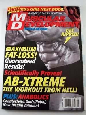
Recently not too long ago I made a trip to the Nutrition House by my local mall to buy a protein supplement. The brand I purchased was called Quick-Mass; it’s a high calorie supplement for mass building (in other words a weight gainer). While I was in the shop it occurred to me while I was looking at other brands how poorly designed a lot of the packaging and advertisements in body building magazines were. If you ever take a look at supplements, nutrients, and stimulants in body building magazines or even packaging in stores they literally look like flashy spam mail that you get in your email. Words like “T-BOMB, EXPLODE! NOS” are used, and catch phrases like “GAIN a 1000-HORSEPOWER!” I mean some of these phrases and words don’t even relate and are associated to fast cars. In my opinion it’s over exaggerated. I really think these particular brands need to reposition their design on their ads and packaging labels in a more tone-down but clever way. I mean, having an over-exaggerated and flashy advertisement may be appealing to the eye but there is already too much of this crap and it’s just adding to more visual clutter.
Mac said to drop Justin Long

As I’m sure many Mac user's and enthusiasts will be heartbroken to hear there has been a lot of talk about ditching Justin Long (the Mac) from future Mac ads. Some critics feel that when the viewer leaves the ad they are left empathizing with the PC and feeling as though Mac is a "smug little twit."(Seth Stevenson, critic for Slate). I personally feel the opposite but I am probably as biased as you can get after using Macs all my life.
Many feel that the "I'm a Mac" campaign has reached perfection and that there is only one way to go from here. Some didn’t believe it would last this long but it's going as strong as ever. Justin Long is both the face and voice of Mac but maybe it is time for the Mac ads to go in a different direction. Though they don’t have the same novelty as they used to I can’t imagine anyone declining to watch a new ad.
Mac is going to need to be careful about what direction they go in now and what voice they use because without the Mac and PC relationship the whole brand will have a completely different feel to it.
Dove's follow up has been released
Dove has recently released their follow up to their campaign of Real Beauty's 'Evolution' tv spot.
Instead of going through the commercial, you can watch it and make judgements for yourself.
This new commercial continue to build the Dove brand and portrays their commitment to the Self Esteem Fund.
Say what you will about Unilever, an equal producer of Sunsilk, but when you segregate Dove as a beauty brand, it has effectively and positively educated young girls and young women about the truths and false pretences of the beauty industry.
To take a step in changing the way the beauty industry communicates to this category challenges other beauty brands, creating a competitive market for the consumer and ultimately sheds light on what we are truly being sold in all other beauty categories.
An ideal of perfection.
Also, what this commercial does differently than its previous contendors is call upon the mothers and caregivers to speak to their daughters about what it means to be beautiful. Too often children are taught and lectured about what to and not to do. Don't do drugs, don't talk to strangers, stay in school, have good manners, don't talk back, don't have sex (or be safe), etc.
What the brand does effectively is call upon those to educate the young about the value and importance of the self.
Something that is all too often overlooked what with all the outer distractions.
o_O ....
There is really nothing special about this post, i just stumbled across this video and decided to share.
An ad campaign for LOUIS VUITTON by Mamoru Hosoda. an updated alice in wonderland, in which a girl, searching for her lost cell phone, floats in a dizzying world of the company’s logos. While waiting to meet her friends outside of a Louis Vuitton store, the girl's cell phone is eaten by the LV Panda, who then promptly swallows her - but the inside of his stomach is gateway to a psychadelic Louis Vuitton wonderland. This ad-cartoon has no particular function than to make the audience go "wow". But its a gorgeous example of "brand fusion" between fashion, graphic design, advertising, and illustration/animators. This is just a minor rebuttle of what was discussed in class last week about Graphic Designers/ illustrators working for Advertisers etc. Get out of this mind set cause its all about "fusion" between all feilds to create good designs.
Has Fashion lost its passion!!


I love shopping ! Especially for shoes, I have 55 pairs of shoes, some that I haven't worn yet. Just because I have allot of shoes does not mean they are quality shoes. On the weekend I looked through my shoes closet which I adore and could live in. Nevertheless I own 15 pairs of sneakers, 30 pairs heals, 5 pairs boots, and 5 pairs sandals/slippers.
I saw this new commercial from Joe Fresh which is sold at the Superstores, Sobeys and other big supermarkets across GTA. I loved the line and fell in love with a pair of shoes from the commercial. I made it my mission to go to the store the following day. The shoes are selling for 16.99 a pair. I am thinking this a steal, inspecting the back of the shoe and to my disappointment it read in small letters made in china. I could buy these shoes and wear them about 10 to 20 times and toast they are(?). But I decided as much as I liked them wasting money was not on my agenda. The Joe fresh store was nicely stocked with all sorts of fashion (Children, Men's wear, Intimate) which equaled throw away fashion. In about 10 washes down the road the fabric will fade or tear and it s ready for garbage pick up. What is it with stores like Payless, Joe fresh and even Sears that think we are stupid. That I wont be able to tell the difference between quality and quantity. I understand people think they have a limited selection but there is WINNERS , H & M, ECCO and plenty more.
Joe Fresh looks very stylish and maybe is the closest to Mark Jacobs in some young girls eyes that she would spend all her allowance to buy clothes and accessories. My point is that its cheap fashion and people allow new companies to continue selling crap like that.
The staff at the store aren't even nice, its not like we are that Holt's.
I hate you Rogers

Now that sure is a strong statement. However, considering that brand identity is supposed to help communicate the various facets found within each company, why was I caught standing in line to return 'Airplane' (starring Leslie Nielsen in his first non-dramatic role) for nearly 20 minutes while two guys were trying to sort out their new phone plans? I know there are dedicated Rogers Wireless kiosks, I've seen them and they have their own logo and trained staff. What I also know is that trying to cram too many services into one location degrades the quality of all of them. Leave the bad wireless integration to less classy establishments like 7/11 (which has a Virgin Mobile sponsorship plan, but that's another post).
Add to this the fact that the store in question failed to stock titles such as Kill Bill and Sin City, and trying to re-brand the Skydome (an excellent Toronto landmark) the Rogers Centre is simply arrogant and silly, I'm willing to say that the Rogers name has more strikes against it than I'd like (excuse the baseball pun).
I hate you, Ted Rogers.
Facebook vs MySpace

You all knew this would come up eventually...
I missed the whole MySpace thing, to be honest. I only jumped on the Facebook bandwagon last year, went through the regular phases of the FB initiate (1. Resistance 2. Grudging Acceptance 3. Ravenous Addiction 4. Continual Creeping), and have finally settled on checking it numerous times a day to see who's commented on one of my photos or sent me a fake drink.
My question is; what was it that allowed Facebook to so fully claim the crown of the most beloved online personal blogging site? The site, which hailed from Harvard (hence the conservative and sleek aesthetic of the menus and type treatment), features the same options that MySpace already had, in come cases directly assimilating add ons and extras. Is it the fact that people can now license their own self made applications for people to use, thereby allowing Facebook to grow as a personalized, organic entity? Or maybe it was that the site was originally intended as a networking facility for post secondary students, thereby lending it an aire of sophistication lacking from MySpace. In any case, the winner is clear, and Facebook's user base just keeps growing exponentially on a daily basis.
Side Note: What did you all think of the rebrand that facebook underwent when it ditched the random "facebook guy" head from the logo, opting for a cleaner typographic look?
